Designing a brand that delivers
Redesigning your brand is a bit like renovating your home. It can be an opportunity to fix the things that have been bothering you and get a fresh start. Or, it can be a costly exercise that leaves you frustrated.
As with a home renovation, the key to success with a brand redesign is to think carefully before you start. Don’t just knock down the (metaphorical) walls and start building: consider your needs, make a plan and talk to the experts. That way, you’re far more likely to end up with a brand-new brand that fits you – rather than an awkward, outdated or mismatched mess.
Here’s what to consider:
1: Does it suit you?
It sounds obvious, but your brand needs to fit your business. It can be tempting to come up with a slick, sleek, modern logo and brand assets, but that doesn’t fit everyone. Think about what you do, who your audience is and your heritage and tone. If you’re an established brand with a long history, it might not make sense to switch to something ultra-modern. Alternatively, if you’re running a tech start-up, make sure your brand doesn’t look old-fashioned.
2: Check out your competition
Don’t redesign your brand without looking at what others in your industry are up to. That’s not to say that you need to copy or match others, but you should know where you stand within your industry. If you’re a courier service and all your competitors are using bright, snappy branding, you can choose to fit in or decide you’re going to be different. Either way, it’s important to know where you fit in a wider context.
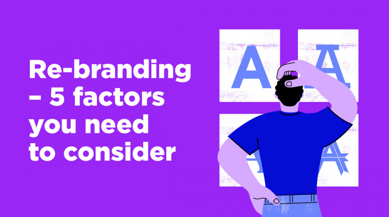
3: Typography matters
Sharp and severe, soft and caring, cutesy and quirky, plain and unobtrusive – your choice of font can communicate more than you might think. Make sure your font choice fits your brand identity. It should also be consistent across communications – don’t use one for your logo, another for your newsletter and a random selection on your website. (And don’t use comic sans. Ever.)
4: Colour choices
Like font, colour choice can say a lot about your business. At a basic level, red represents urgency and speed, yellow is bright and cheerful while blues and greens are softer and calmer. Of course, there’s more subtlety involved – tone, shade and different combinations can all communicate quite different things.
5: Ready to scale
These days, your logo and other branding elements don’t just appear on your letterhead or business card. They’ll need to work on your website – whether on a cell phone or larger screen – in online ads and print, even on a huge billboard or outdoor advertising. This means that they need to be clear and recognisable at any size. Tiny text or intricate details can make this difficult, so keep them simple – and be sure to check the look in multiple formats before you sign off.
Ready to start your redesign? Talk to us now.